Apply to Machine Learning

Download anaconda Jupyter Notebook (https://jupyter.org/) and install. After run server by opening file. You can see that open web page and create folder and create file as you like. You want to download dataset (ex :-https://www.kaggle.com/ ) and upload to same folder.
Steps :-
- import pandas library :
import pandas as pd
2. import data set as csv .
df = pd.read_csv(‘weather.csv’)
3. See table view
df.head()

4. Check table column data types
df.dtypes
5. Check number of rows and column of dataset
df.shape
6. Seeing statical figure of dataset
df.describe()

Data Visualization
So, It is very important because We can identify behavior of the features, individual features and we can see how to depending each other.
- Import Library
import matplotlib.pyplot as plt
import seaborn as sns
2. Then, we want to find best plot required for your use case.
1 => Simple Histogram (we check count of each Temp value)

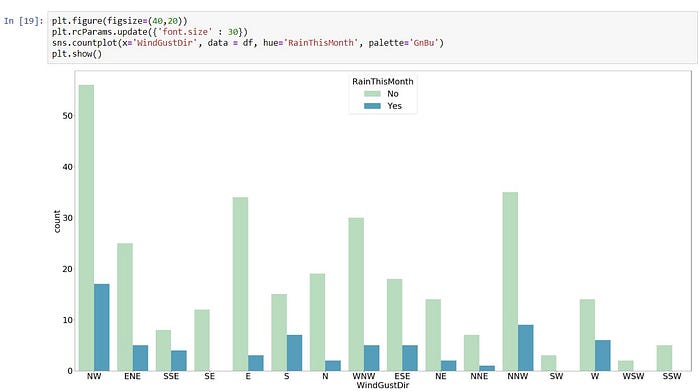
2 => Simple Count Histogram (we check count of categorical values, like checking rain or not according to wind directions)
x -> ‘WindGustDir’
y -> count of ‘RainThisMonth’
plt.figure(figsize=(40,20))
plt.rcParams.update({‘font.size’ : 30})
sns.countplot(x=’WindGustDir’, data = df, hue=’RainThisMonth’, palette=’GnBu’)
plt.show()
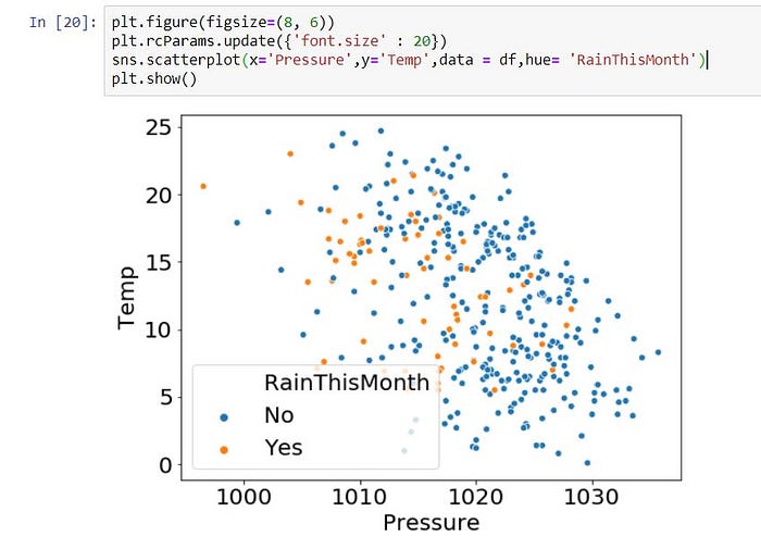
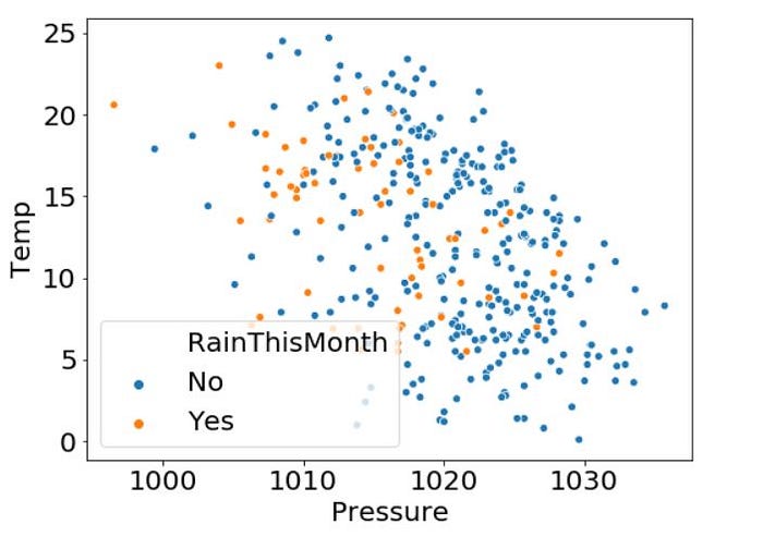
3 => Simple Scatter Histogram (we check rain or not according to Pressure and Temperature)
plt.figure(figsize=(8, 6))
plt.rcParams.update({‘font.size’ : 20})
sns.scatterplot(x=’Pressure’, y=’Temp’, data = df, hue= ‘RainThisMonth’)
plt.show()
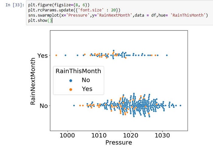
4 => Simple Swarm Histogram (sometimes not suitable by using scatter plot, then we can use Swarm plot)
plt.figure(figsize=(8, 6))
plt.rcParams.update({‘font.size’ : 20})
sns.swarmplot(x=’Pressure’,y=’RainNextMonth’,data = df,hue= ‘RainThisMonth’)
plt.show()
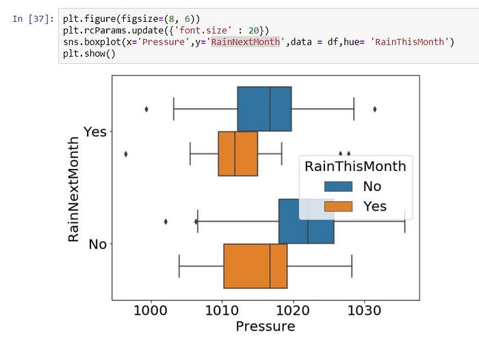
5 => Simple Box Histogram (sometimes not suitable by using scatter plot, then we can use Box plot, specially It suitable to apply for categorical columns)
plt.figure(figsize=(8, 6))
plt.rcParams.update({‘font.size’ : 20})
sns.boxplot(x=’Pressure’, y=’RainNextMonth’, data = df, hue= ‘RainThisMonth’)
plt.show()
6 => Simple Violin Histogram (Same situation with Box Plot)
plt.figure(figsize=(8, 6))
plt.rcParams.update({‘font.size’ : 20})
sns.violinplot(x=’Pressure’,y=’RainNextMonth’,data = df,hue= ‘RainThisMonth’)
plt.show()
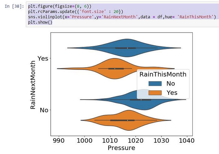
Then, You can select which graph type is suitable for your use-case.
Data Preprocessing
We know, we get datasets from different sources. So, It could have been missing values, Outliers and Noises. So We have to handle them to fit the model.
- Handling Missing Values
df.isnull().sum()
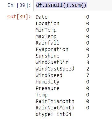
If you have missing value, you want to drop or fill. This step want to do before visualization.
Drop Null Values
df.dropna()
Fill the Null Value with the Next Value
df.fillna(method=’ffill’)
Drop Column if you do not want
df.drop(‘WindGustDir’, axis=1)
2. Outlier Removal
(i) Using Z-Core Approach
Import Libraries
import numpy as np
from scipy import stats
Identify Outliers using plot view
You can see some outliers has this plot. So,
df2 = df[(np.abs(stats.zscore(df[‘Pressure’])) < 3)]
df2 = df2[(np.abs(stats.zscore(df2[‘Temp’])) < 3)]
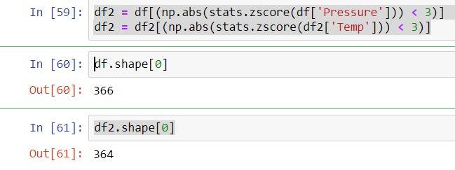
Two data rows are when using z score out-lier remove.
(ii) Using Quantile Approach
q = df[‘Pressure’].quantile(0.9)
df3 = df[df[‘Pressure’] < q]q = df3[‘Temp’].quantile(0.98)
df3 = df3[df3[‘Temp’] < q]
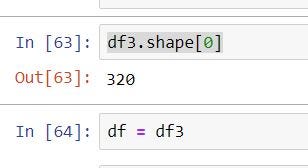
you can see removing rows from dataset
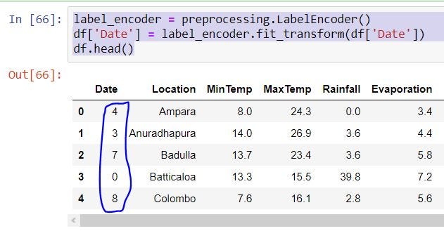
3. Encoding Categorical Variables
If you have categorical variables, So you want to set number for that each categories.
Import Library
from sklearn import preprocessing
We add numbers for Categorical Columns like ‘Date’, ‘ Location’, ‘ WindGustDir’, ‘RainThisMonth’, ‘RainNextMonth’.
label_encoder = preprocessing.LabelEncoder()
df[‘Date’] = label_encoder.fit_transform(df[‘Date’])
df.head()
Data Normalization
Some column values can have more or less than other column values. If we think, more column values are range in 1–10, but some column value are range in 1000–5000 like that, then we should convert that some columns to like most of other columns values.
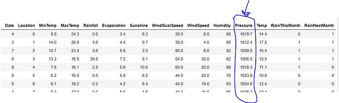
You can see this Pressure column different range among other column. So we want to normalize this column.
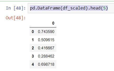
x = df[[‘Pressure’]].values
min_max_scaler = preprocessing.MinMaxScaler()
df_scaled = min_max_scaler.fit_transform(x)pd.DataFrame(df_scaled).head(5)
Feature Engineering
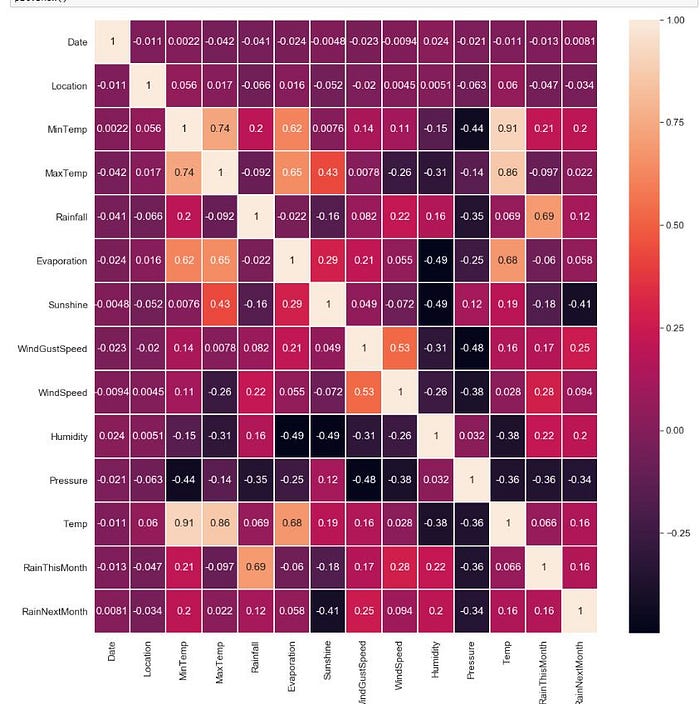
Correlation Analysis
We can to remove redundant features by looking correlation map. We have to remove this redundant features, because It affect to algorithm. If 2 features has high correlation or high inverse correlation(we can display as negative sign)
plt.figure(figsize=(18,18))
plt.rcParams[“axes.labelsize”] = 20
sns.set(font_scale=1.4)
sns.heatmap(df.corr(), annot = True, linewidths=1)
plt.show()
Create method to drop features
def find_correlation(data, threshold=0.9):
corr_mat = data.corr()
corr_mat.loc[:, :] = np.tril(corr_mat, k=-1)
already_in = set()
result = []
for col in corr_mat:
perfect_corr = corr_mat[col][abs(corr_mat[col])> threshold].index.tolist()
if perfect_corr and col not in already_in:
already_in.update(set(perfect_corr))
perfect_corr.append(col)
result.append(perfect_corr)
select_nested = [f[1:] for f in result]
select_flat = [i for j in select_nested for i in j]
return select_flat
Execute Drop Features
columns_to_drop = find_correlation(df.drop(columns=[‘RainThisMonth’]), 0.9)
df4 = df.drop(columns=columns_to_drop)df4
Add Features